Brought to you by Scott P. Rogers, Funkhouser Real Estate Group, 540-578-0102, scott@HarrisonburgHousingToday.com
Brought to you by Scott P. Rogers, Funkhouser Real Estate Group, 540-578-0102, scott@HarrisonburgHousingToday.com
Wednesday, August 12, 2015

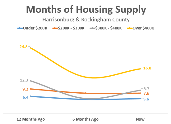
The "months of supply" illustrated in the graph above shows how many months it would take to sell all homes currently listed for sale in each price range given the current pace of buying activity in that price range. As you can tell, each price range is performing differently. Let's take a closer look....

The good news, as shown above, is that over the past 12 months, all price ranges have seen a decline in the months of housing supply available on the market for sale. The decline in the months of supply available ranged from 13% to 32%. But when we look changes over the past six months, we find a bit of a different phenomenon....

As shown above, almost all price ranges are seeing more months of supply available now as compared to six months ago. The largest increase in housing supply has been in the $300K - $400K price range with a 56% increase in months of supply over the past six months. The only price range that did not experience an increase in available housing supply has been the $200K - $300K price range.
A few concluding thoughts....
- The under $200K price range continues to be healthy because even with the 6% increase in months of housing supply, it is the price range with the lowest supply levels. Six months is considered to be a balance between buyers and sellers in the market, and this price range actually has less than six months of housing supply available.
- The $200K - $300K price range is (in some ways) the healthiest, as it did not see an increase in the available housing supply over the past six months.
