Brought to you by Scott P. Rogers, Funkhouser Real Estate Group, 540-578-0102, scott@HarrisonburgHousingToday.com
Brought to you by Scott P. Rogers, Funkhouser Real Estate Group, 540-578-0102, scott@HarrisonburgHousingToday.com
Wednesday, May 16, 2012

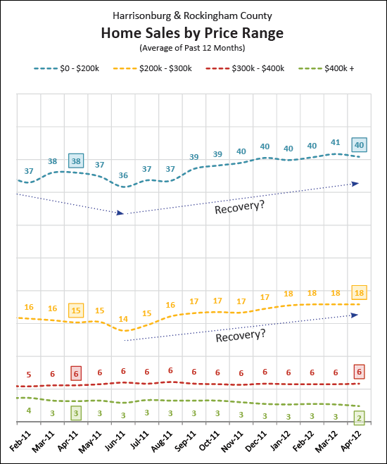
The graph above shows the average number of home sales per month (in each of four price ranges) when evaluating a 12-month time period. For example, the last data point shows the average number of home sales per month for May 2011 - April 2012.
As is quite evident, the recovery (in the pace of home sales) is more pronounced in the lower price ranges.
