Brought to you by , Funkhouser Real Estate Group, , scott@HarrisonburgHousingToday.com
Tuesday, May 25, 2010
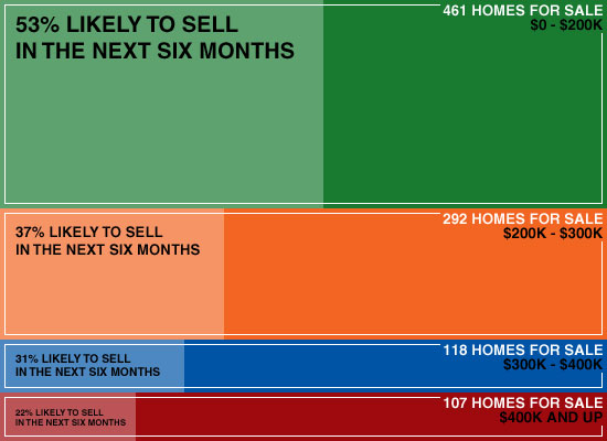
For the visual learners amongst us, here's a new take on the mix of homes for sale based on their price range, and the demand for such homes....

This (hopefully fun and self-explanatory) graph is based on inventory levels as of May 10, 2010, and average home sales per month from May 2009 through April 2010.
Questions? Clarifications?

This (hopefully fun and self-explanatory) graph is based on inventory levels as of May 10, 2010, and average home sales per month from May 2009 through April 2010.
Questions? Clarifications?
